
WellWithinU
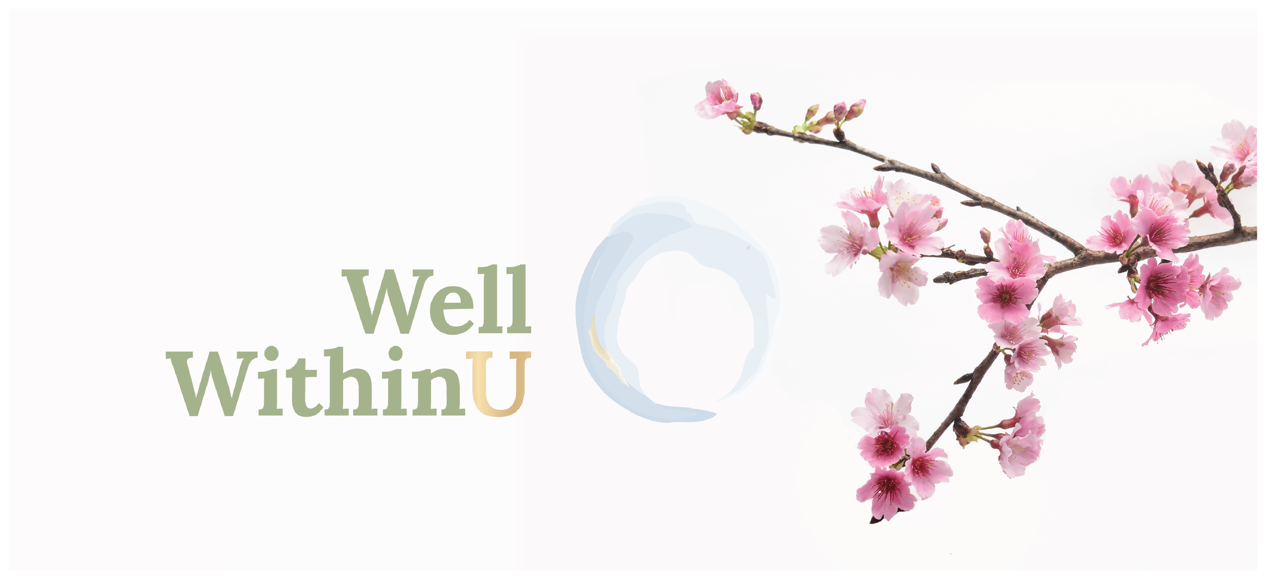
Creating a brand identity rooted in balance, individuality and the belief that meaningful change begins from within.
Brand Strategy · Visual Identity · Logo Design · Colour Palette · Typography · Brand Guidelines · Website Design & Development · Collaborative Copywriting
The Challenge
WellWithinU was founded on a simple but powerful belief: lasting improvements to our wellbeing come not from striving for perfection, but from understanding ourselves and making small, sustainable changes.
Founder Julie DeFilippo needed a visual identity that reflected this philosophy. The brand needed to feel calm and reassuring, while communicating an approach to wellbeing that was both personal and grounded in practical guidance. With the business name already established, the challenge was to develop a distinctive visual language that would bring its meaning to life.
Exploring the Possibilities
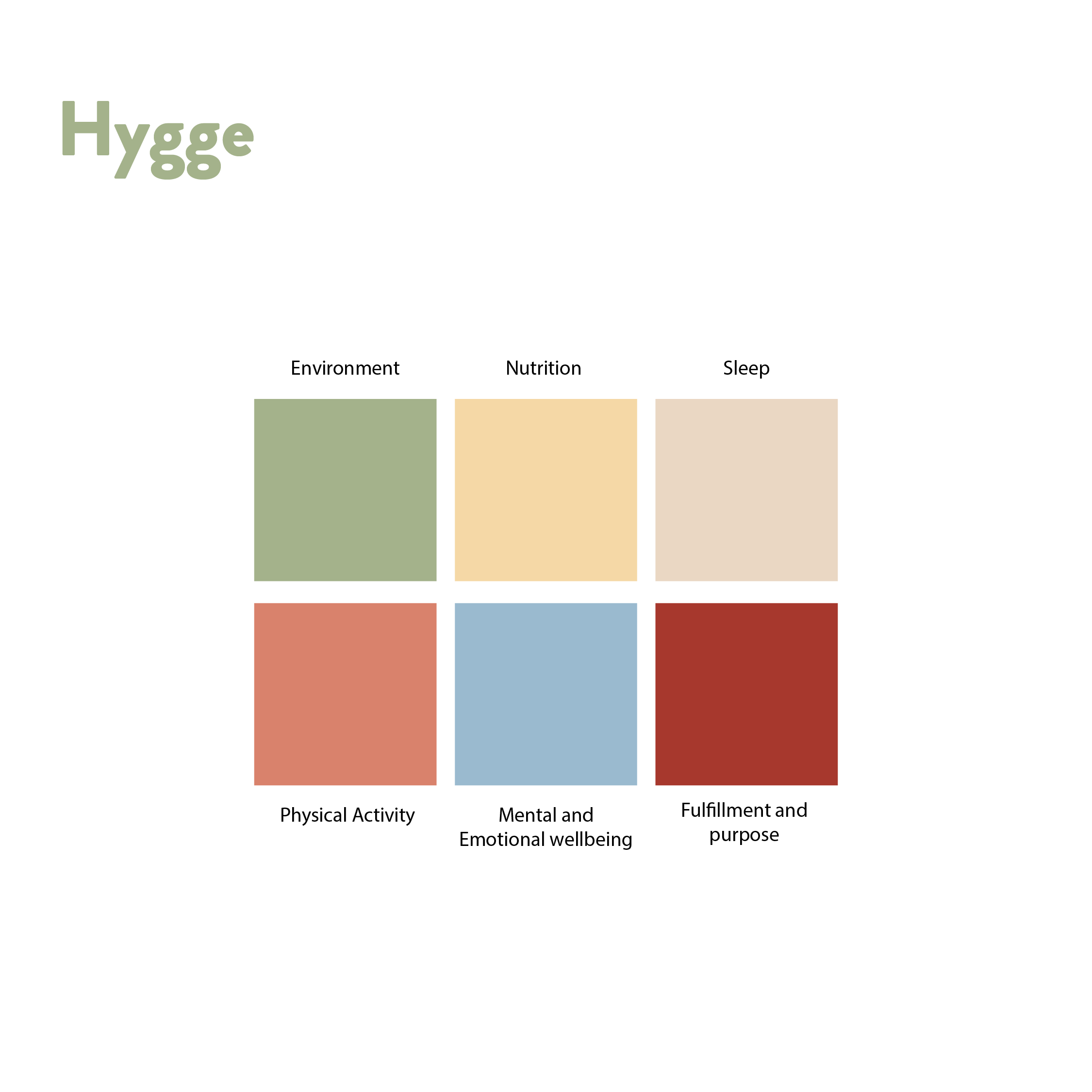
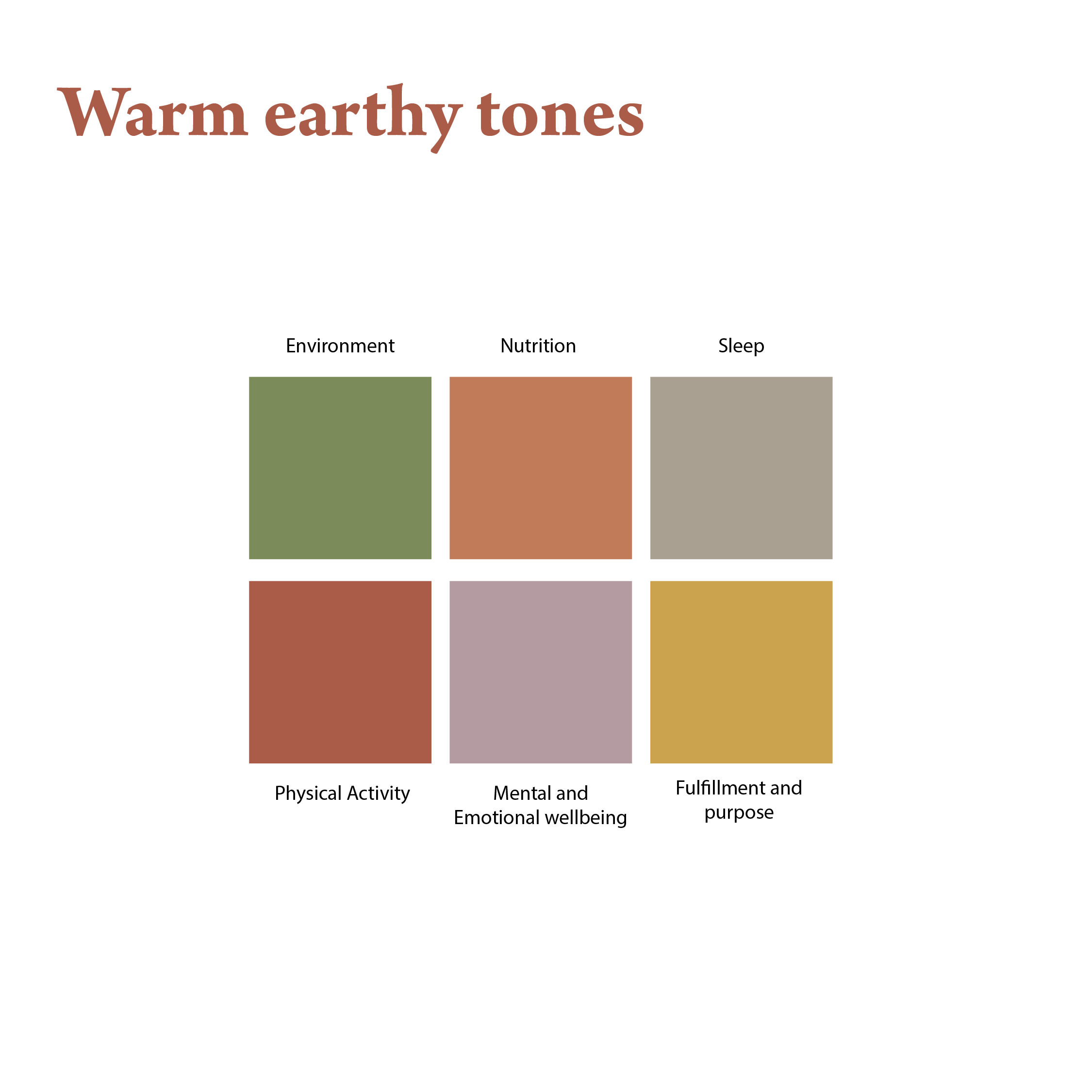
The creative process began with an exploration of colour, symbolism and cultural approaches to wellbeing. Early directions drew on Scandinavian ideas of comfort, simplicity and balance, including hygge, alongside earthy palettes, softer Nordic-inspired colours and more contemporary combinations. Logo concepts explored geometric forms, botanical motifs and symbols associated with warmth, growth and restoration.

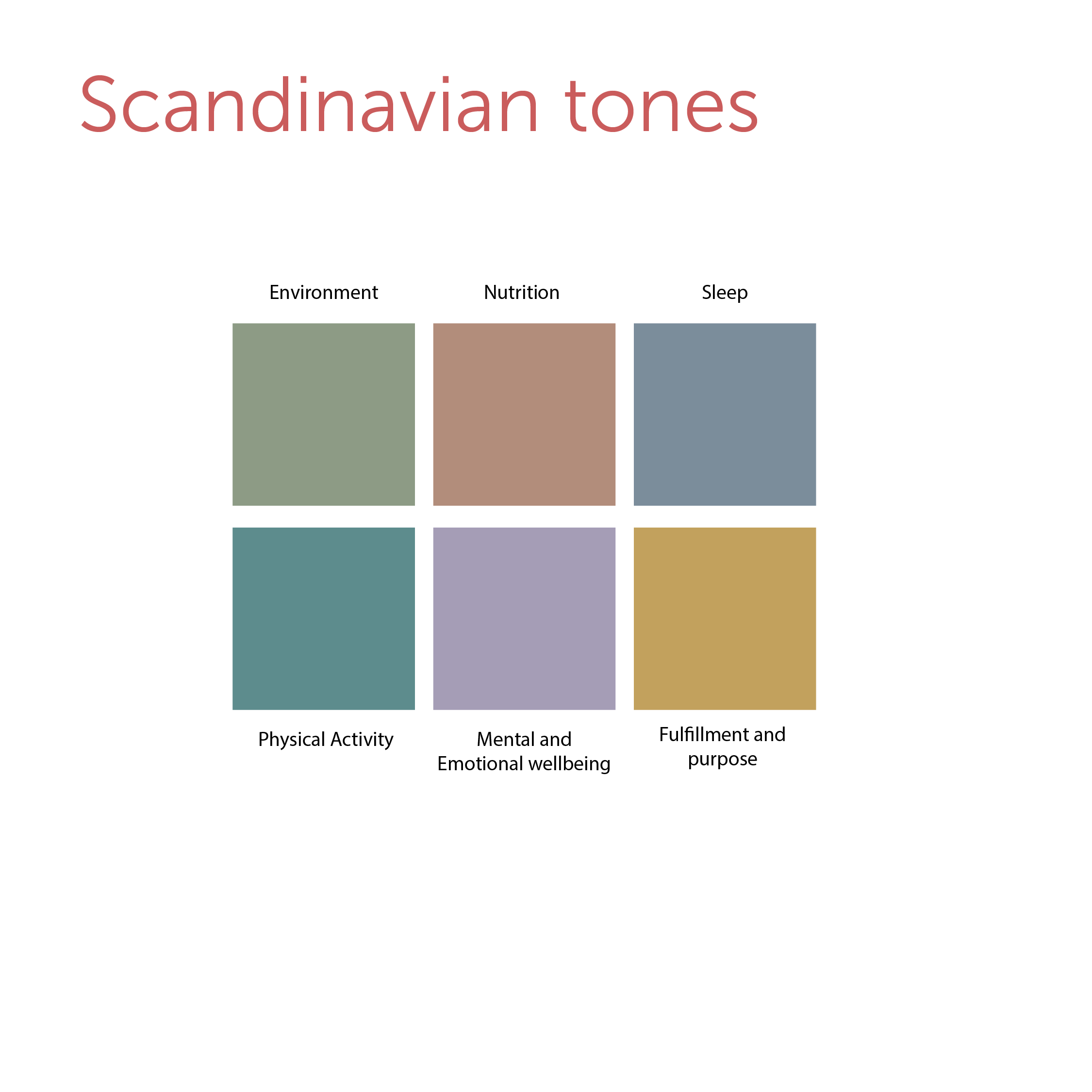

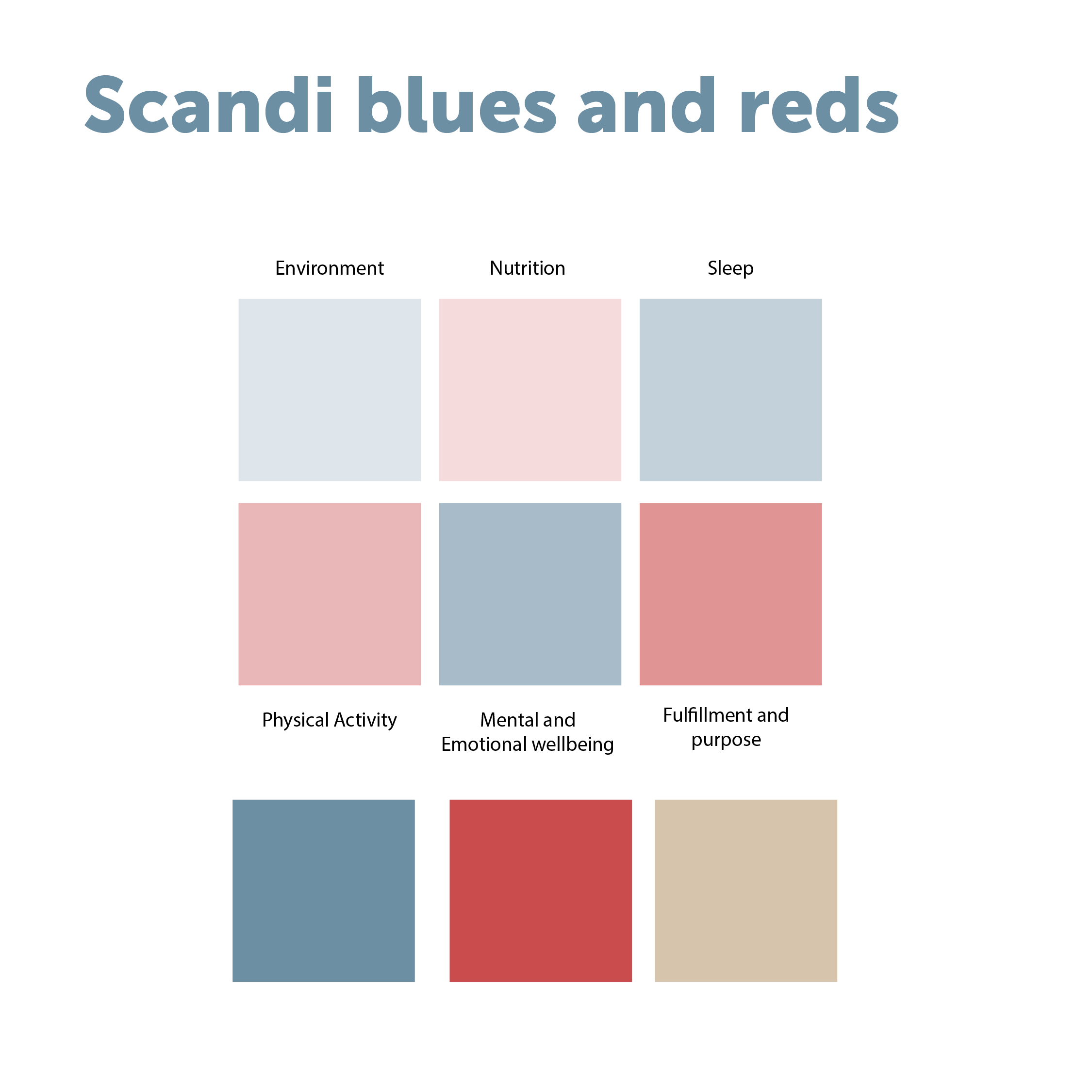
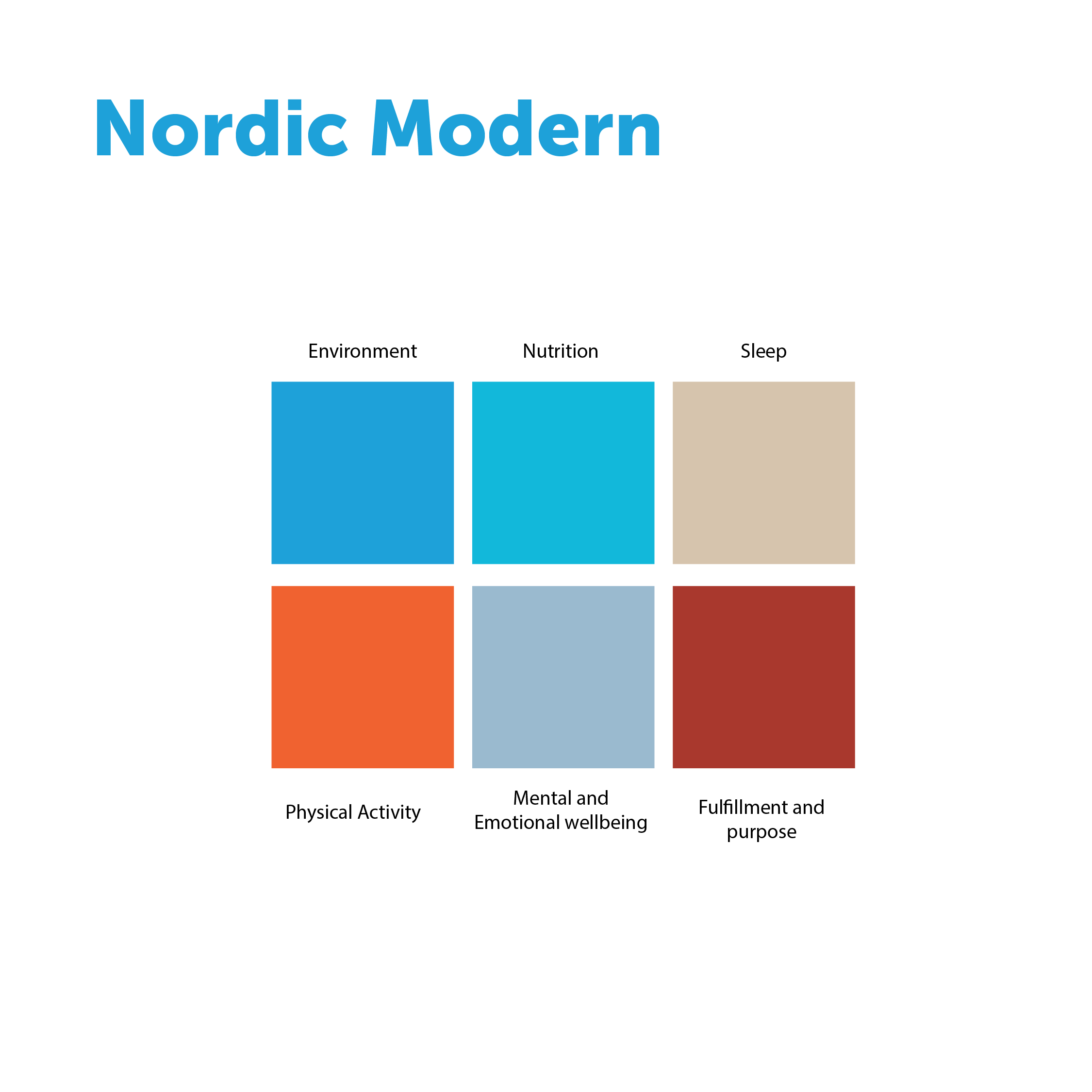

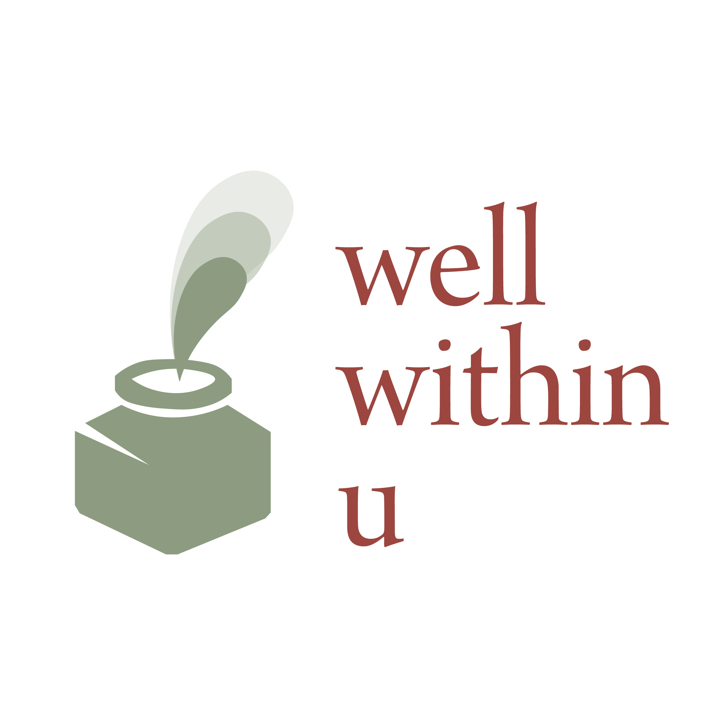
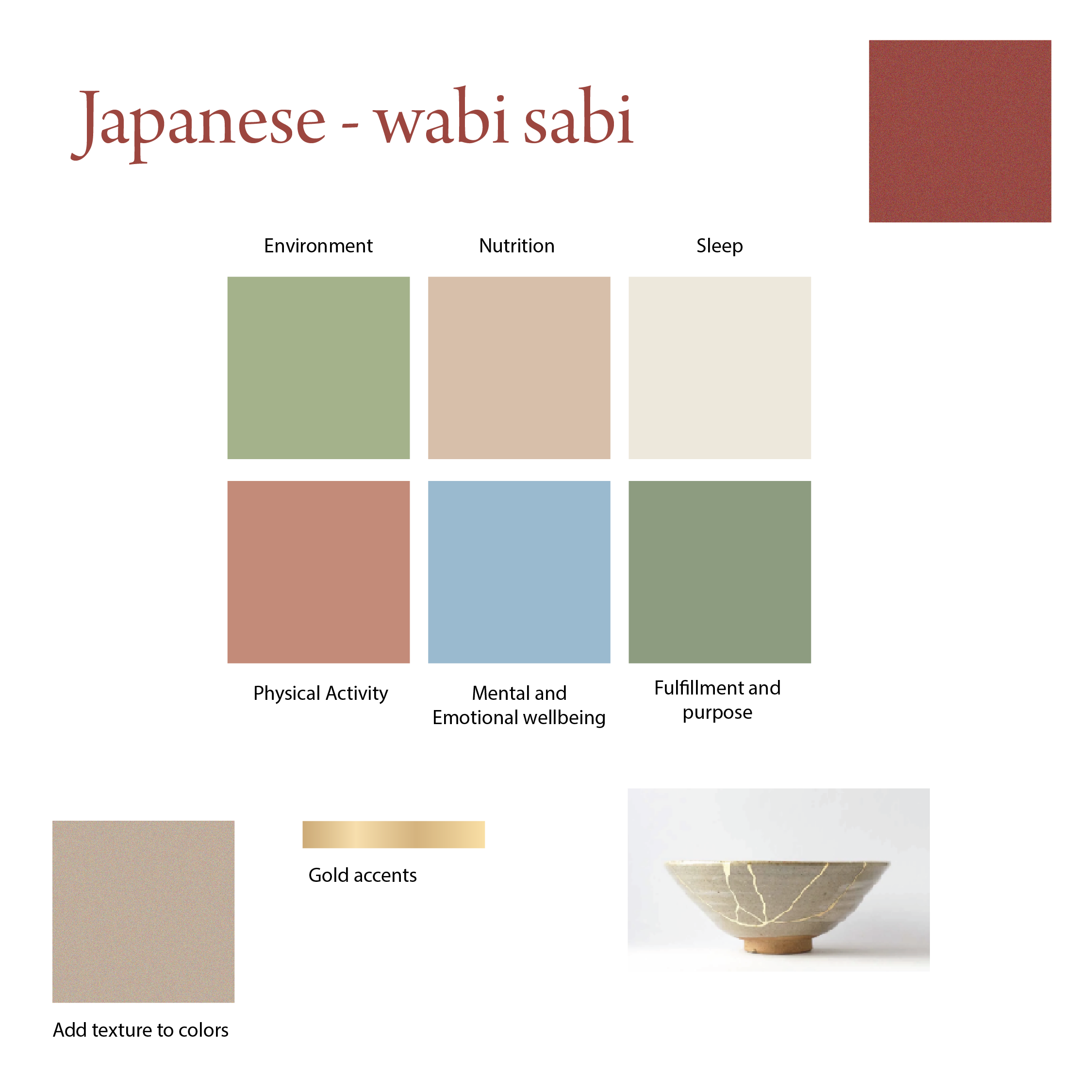
As the ideas developed, we found a particularly meaningful direction in the Japanese philosophy of wabi-sabi: appreciating beauty in imperfection and recognising the natural rhythms of life. This led us towards a gentler, more organic identity that felt closely connected to Julie's approach.
Finding the Meaning Within
The final identity centres on an imperfect, hand-painted circle. Representing wholeness and continuity, the circular form also evokes a well: a source of depth and replenishment, reflecting the idea that the resources for meaningful change can be found within ourselves.
A delicate gold accent references kintsugi, the Japanese art of repairing broken pottery with gold. Rather than concealing imperfections, kintsugi celebrates them as part of an object's history — a fitting expression of Julie's belief that our experiences help shape who we become. The resulting mark is deliberately soft and understated, expressing calm, acceptance and the possibility of renewal.
A Palette with Purpose
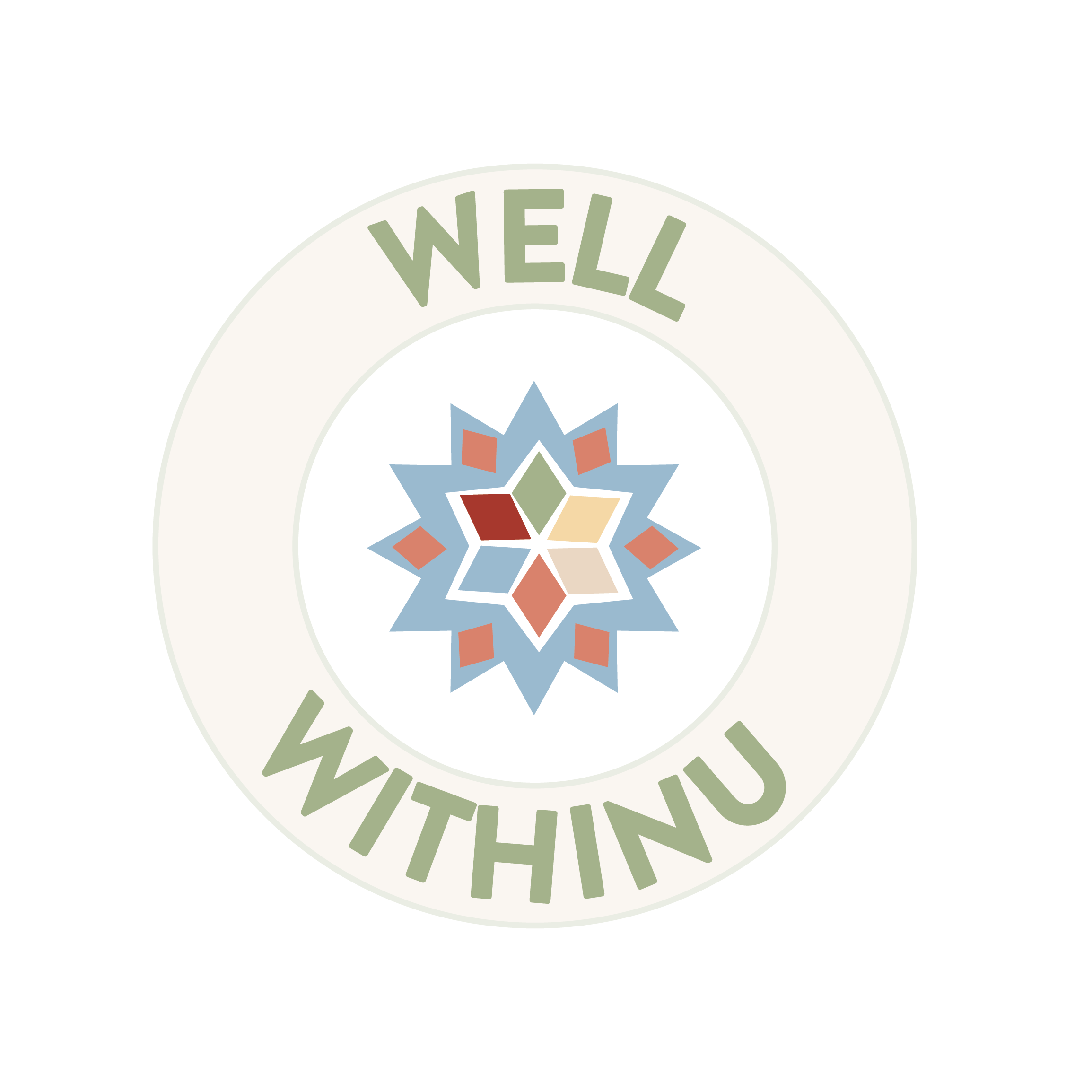
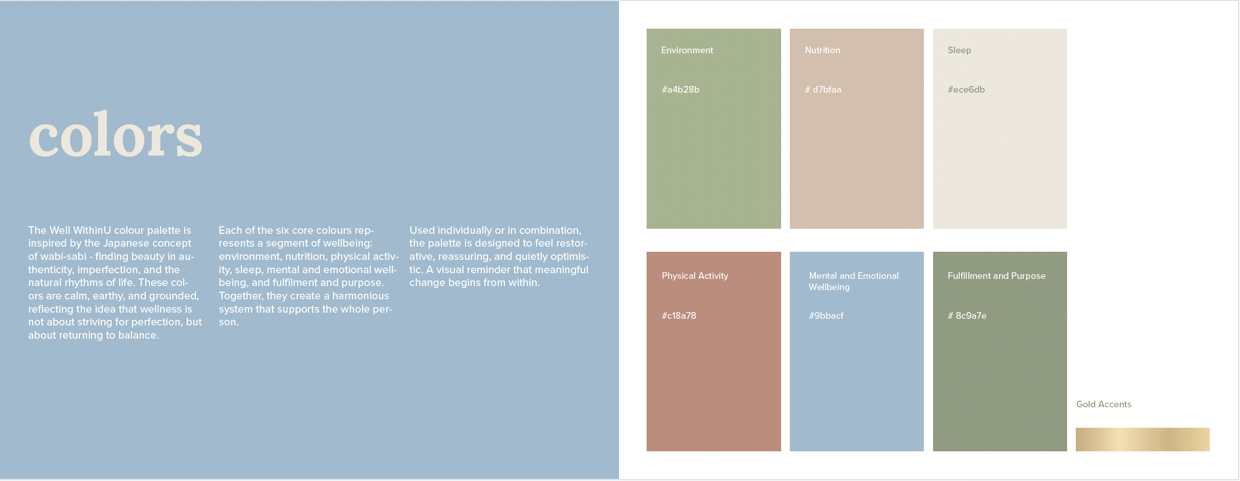
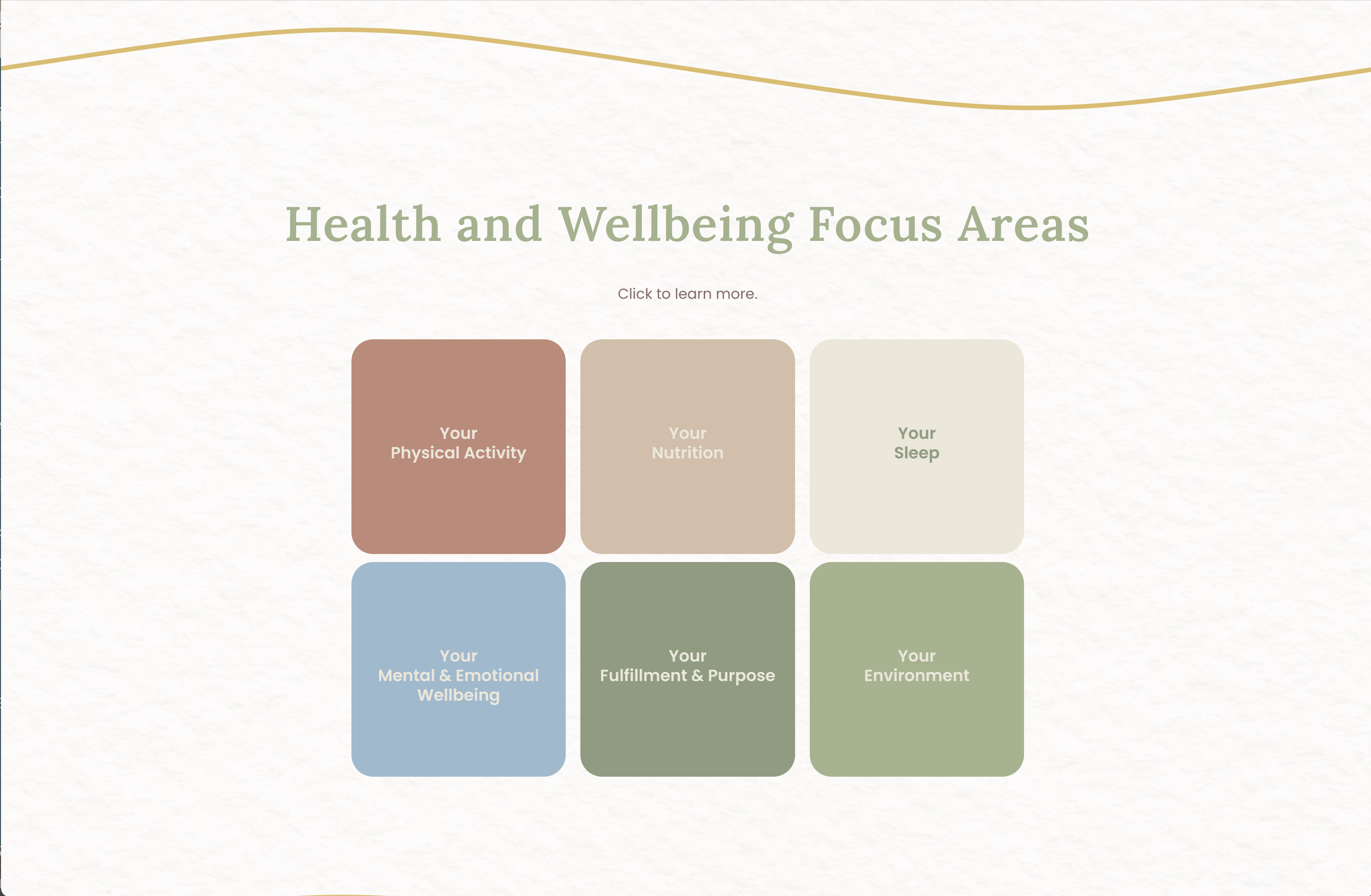
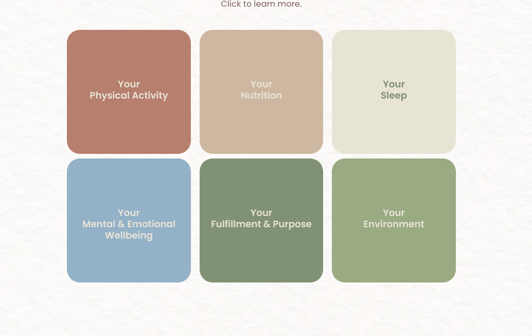
The six core colours were developed to represent the six dimensions of wellbeing addressed through Julie's coaching: environment, nutrition, sleep, physical activity, mental and emotional wellbeing, and fulfilment and purpose. Soft greens, warm neutrals, muted terracotta and gentle blue create a cohesive palette that feels restorative without becoming overly clinical.
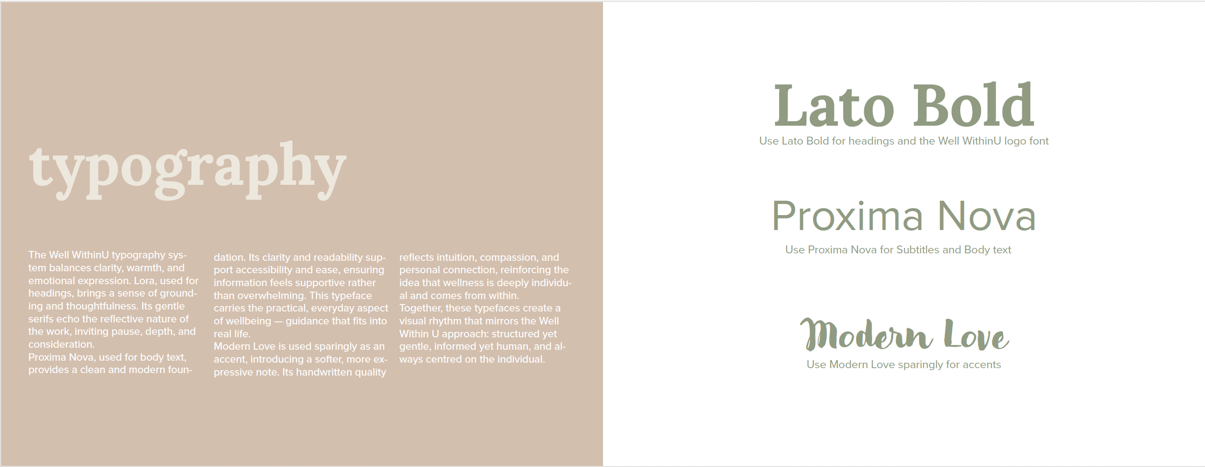
A complementary typography system brings together the warmth of Lora, the clarity of Proxima Nova and the expressive, handwritten character of Modern Love. Together, these elements create a brand that feels thoughtful, approachable and grounded in Julie's holistic approach.
Bringing the Brand to Life
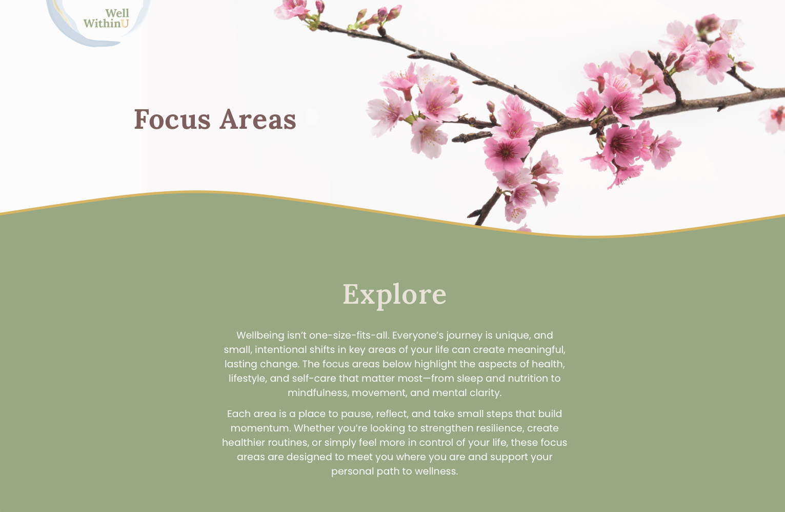
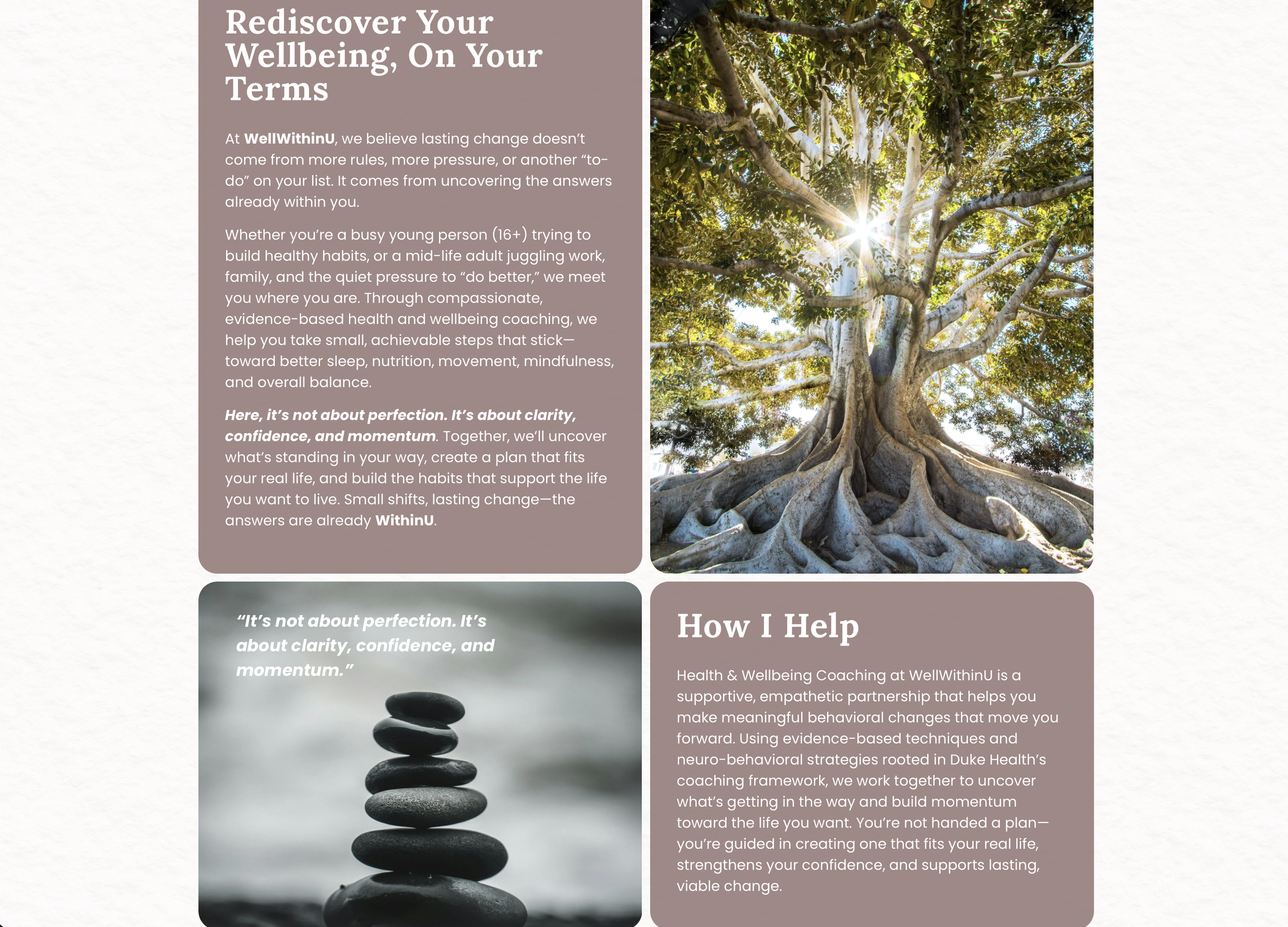
The new identity became the foundation for a website designed to reflect Julie's philosophy of gentle, sustainable change.
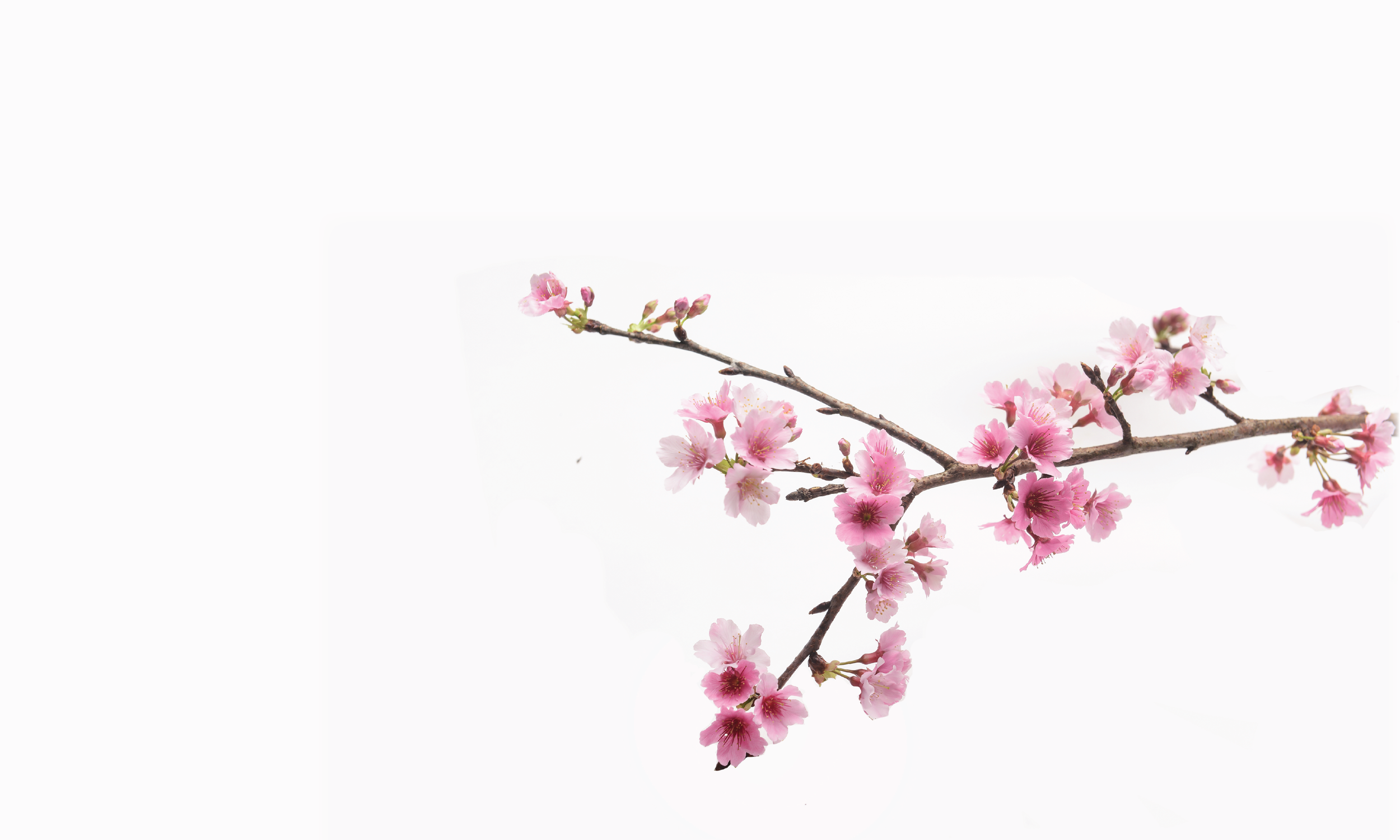
Cherry blossom imagery was chosen as a recurring visual theme, symbolising renewal, growth and the beauty of life's changing seasons. Alongside the soft colour palette, organic brushstrokes and subtle gold accents, it helped establish a distinctive visual language for the brand.
Once the brand was established I designed and built the website, working collaboratively with Julie to develop its content. Through an exchange of ideas, edits and refinements, we shaped the copy to communicate her approach clearly while retaining her individual voice. The six-colour system was carried through into the website, helping visitors explore the different dimensions of wellbeing.
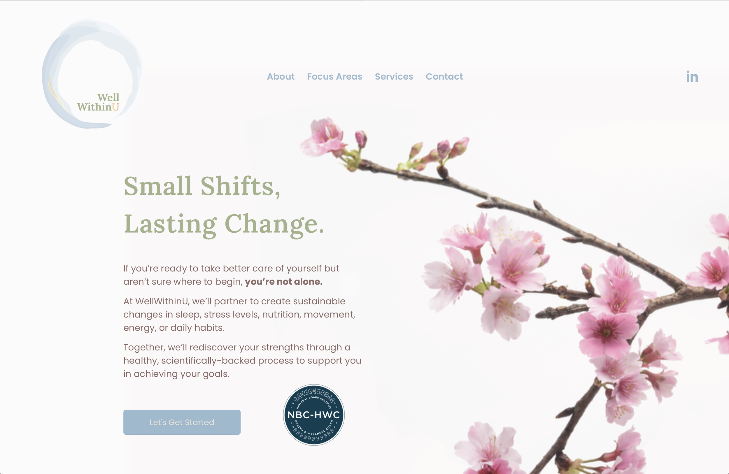
The result is a cohesive brand and digital presence in which the identity, imagery, content and website design all work together to communicate the same underlying message, that small shifts can lead to lasting change.