Brand and Identity
Brand & Identity: Crafting Visual Stories That Connect
Whether you’re a new venture, an established business, or a community group, Beach Creative works with you to create a brand identity that reflects your values, engages your audience, and grows with you.
Branding is more than just a logo - it’s the visual language of your business, the palette that tells your story, and the consistency that builds trust. Beach Creative partners with organisations of all sizes to define, refine, or refresh your brand identity. From colour palettes and typography to logos, stationery, and visual guidelines, we make sure your brand is cohesive, recognisable, and ready to shine across all platforms.
How we help
Brand Discovery & Strategy
Understanding your business, goals, and audience
Translating values into visuals and tone
Positioning your brand for your market
Logo Design
Concept development and iterations
Handcrafted logos that reflect your identity
Flexible delivery for digital and print
Visual Identity
Colour palettes, fonts, and imagery guidelines
Stationery, business cards, and collateral
Templates for consistency across platforms
Flexible Support
Short projects or full-scale identity development
Work alongside your team or independently take ownership
Case Studies
-

LIPS – Rutland Investment Group
Challenge: LIPS is a social investment group in a small village in Rutland. They needed a visual identity that reflected their community spirit and the rural English setting.
Solution: Beach Creative developed a bespoke logo using soft, earthy tones inspired by the local landscape. A complementary colour palette and typography guidelines were created to ensure consistent use across stationery, communications, and future materials.
Result: A welcoming, distinctive brand that visually communicates LIPS’s ethos, supports community engagement, and provides a foundation for all future communications.
-
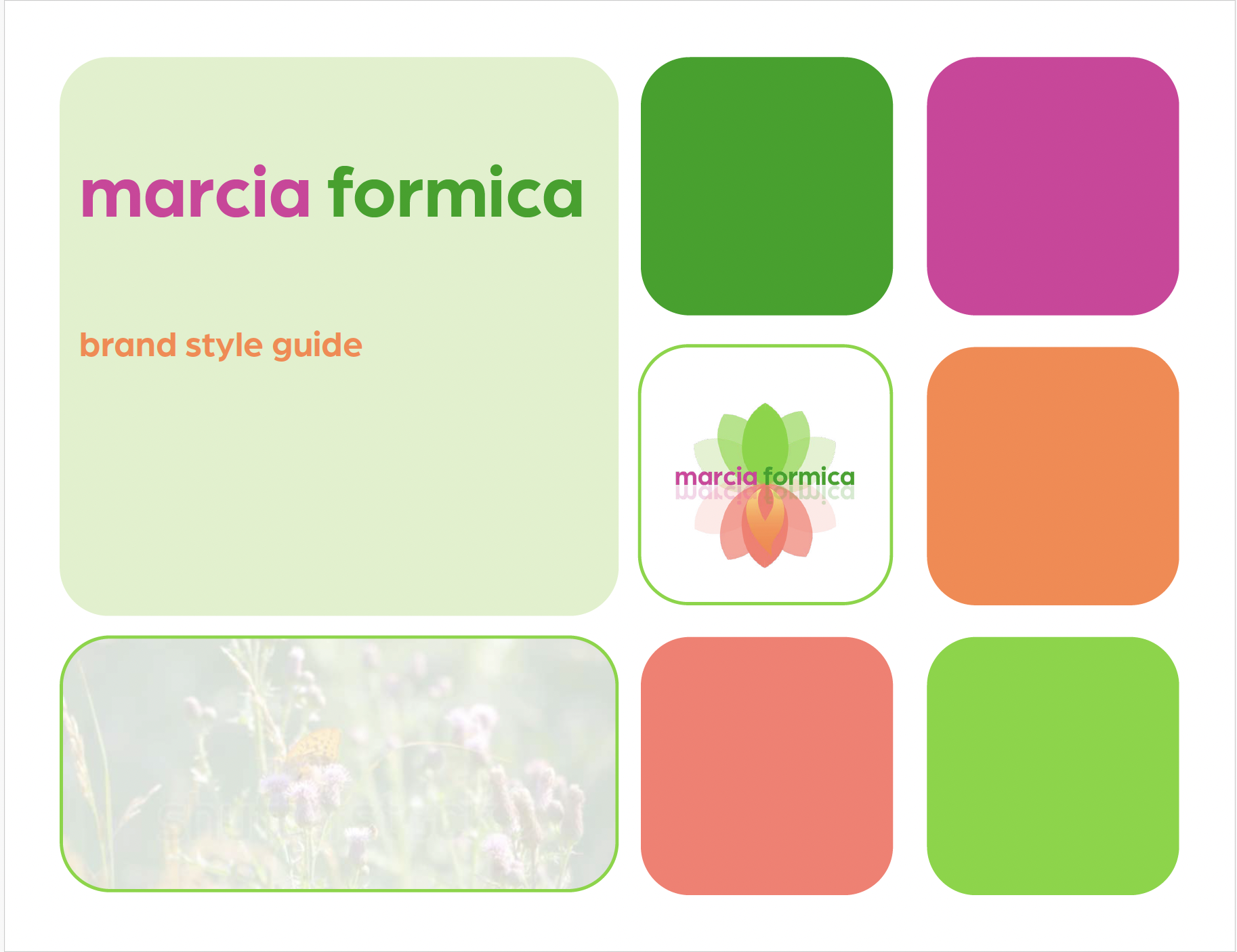
Marcia Formica – Personal Brand & Sub-Brands
Challenge: Marcia needed a cohesive brand that could encompass multiple areas of her work — her book, blog, and native gardening consultancy — while ensuring each sub-brand felt connected but distinct.
Solution: Beach Creative developed a master brand system and created sub-brands for each area of her work, with logos, colour palettes, and typography that shared visual cues. This allowed each project to have its own identity while maintaining an overarching brand coherence.
Result: A flexible brand framework that visually unites all aspects of Marcia’s work, making it easy for audiences to recognise her projects and engage with her content across platforms.
-
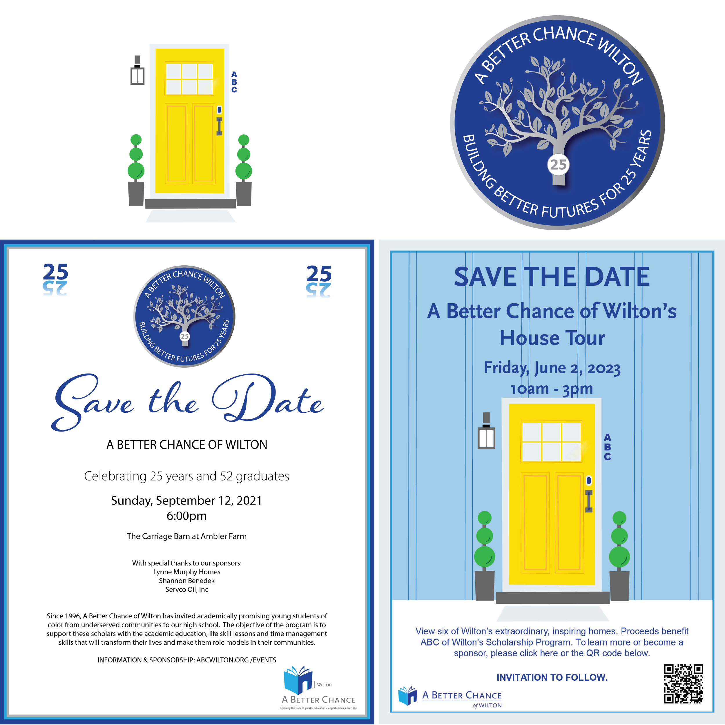
A Better Chance Wilton – Event Branding
Challenge: A Better Chance Wilton needed branding for key fundraising events, including their 25-year gala and annual open house. The goal was to make each event feel special, recognisable, and aligned with the organisation’s mission.
Solution: Beach Creative designed logos, visual motifs, and colour palettes for each event, ensuring they were visually connected to the organisation’s overall brand. Event materials included invitations, posters, digital graphics, and signage, all maintaining a cohesive look.
Result: Highly recognisable, professional event branding that enhanced visibility, supported fundraising goals, and gave the organisation a polished, memorable presence for attendees and donors.

Even small ideas can take time to bloom.
Our Packages in Brief
-

Starter Brand Package
Who it’s for:
Small businesses or community groups needing a logo and basic colour palette.
Includes:
2–3 logo concepts, one colour palette, basic typography guidance, handover files.
-
Growth Brand Package
Who it’s for:
Growing organisations that want a full identity system to support marketing and communications.
Includes:
Multiple logo options, expanded colour palette, typography, brand usage guidelines, stationery templates.
-

Complete Brand Package
Who it’s for:
Organisations needing a fully integrated brand identity across multiple touchpoints.
Includes:Bespoke logo, full colour palette, typography, stationery, visual guidelines, and templates for social media and marketing materials.
Contact us for more information about a package to suit your needs
“I really enjoyed working with Sarah on my website’s design and company’s branding. She is very professional, has a great attention to detail and is very creative. In addition Sarah is very easy to work with, always available, totally supportive and kept me on task.”
Testimonials
“Working with Sarah Beach and Beach Creative on GOOD Morning Wilton’s 10-year anniversary logo was both a pleasure and a meaningful experience. Sarah truly listened to my ideas and what GMW represents, then responded with creative, thoughtful solutions that perfectly captured what I wanted to convey. The result felt authentic, celebratory and exactly right for such an important milestone.”
“Our village investment group has been in existence for about twenty years. It came as quite a surprise to us that we were all twenty years older and it was over 10 years since we had recruited any new members so we decided we needed to tell people in our village about us and possibly recruit some younger members. Sarah is my daughter and has run a successful business in the USA for a number of years helping start-ups, charities etc. so I spoke to her about what we wanted to do. She quickly mapped out a range of ways forward ( I think you might call it a marketing strategy) and designed a series of logos that we could use as part of an awareness raising campaign we launched using our village WhatsApp group. The campaign and our logo (that was designed to evolve over the campaign, slowly revealing what we were about and how people could join) was a great success. Now, just about everyone in the village knows about LIPS. ”